Ditch the Color Wheel: The Outdated Matching Rules That Are Quietly Killing Your Personal Style
Let's talk about the color wheel. You know the one — that cheerful little circle hanging in every middle school art class, dividing the universe into complementary pairs and "safe" combinations. Somewhere along the way, fashion absorbed this diagram like gospel, and now millions of people are standing in front of their closets every morning, quietly self-editing based on rules they can't even fully explain.
Red and pink? "Too much." Orange and purple? "A little chaotic, don't you think?" Brown and black? Depends on which decade you're asking in.
Here's the thing nobody says out loud: those rules were never really about style. They were about control. And it's past time to let them go.
Where These "Rules" Actually Came From
Traditional color theory was developed for painters — people working with pigment on canvas, trying to create visual harmony in a static image. It was a technical framework, not a lifestyle guide. But somewhere in the mid-twentieth century, fashion editors and department store stylists adopted this system as a shortcut for helping mass audiences "not make mistakes."
The problem? Personal style isn't a painting. It moves. It breathes. It exists in three dimensions and interacts with light, skin tone, environment, and emotion in ways no static wheel can predict. When you flatten all of that complexity into "stick to analogous colors," you're not getting dressed — you're following a template.
And templates, by definition, look like everyone else.
The Combinations Everyone Told You Were Wrong (That Are Actually Iconic)
Let's get specific, because theory is great but real examples are better.
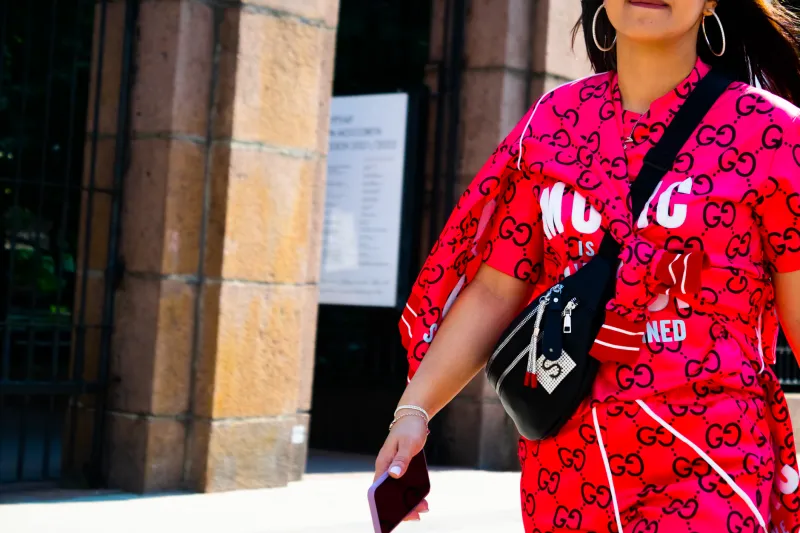
Red + Pink: Fashion has been terrified of this pairing for decades, calling it "clash-y" and "overwhelming." But Valentino built an entire era-defining collection around it. Styling a cherry red blazer over a dusty rose slip dress? That's not a mistake — that's a mood. The tonal tension between the two shades creates depth that a monochrome look simply can't touch.
Orange + Cobalt Blue: Technically, these are complementary colors on the wheel, so you'd think they'd get a pass. Nope — people still panic when they see this combo IRL. But burnt orange wide-leg trousers with a saturated blue fitted top? That's the kind of outfit that makes people stop you on the street in the best possible way. It's warm, it's electric, it's confident.
Olive Green + Burgundy: This one gets labeled "muddy" by the rule-followers. In reality, it's one of the most sophisticated autumn combinations you can put together. The earthiness of olive grounds the richness of burgundy, and the result feels luxurious without trying too hard.
Yellow + Lavender: Soft and sweet? Sure. But also genuinely unexpected and beautiful. A butter-yellow oversized shirt tucked into lavender wide-leg pants hits different than anything your traditional color wheel would ever suggest. It's playful without being juvenile, and it photographs like a dream.
The throughline in all of these? None of them follow the "rules." All of them work.
Why Your Brain Is Actually Better at This Than Any Chart
Here's something the fashion industry doesn't advertise: human beings have an innate visual intelligence that is shockingly good at detecting harmony. You've been processing color combinations your entire life — in nature, in food, in art, in interior design. Your gut reaction to a color pairing is pulling from an enormous subconscious library of visual experience.
When you look at two colors side by side and feel something — excitement, joy, that little spark of yes — that's not random. That's your aesthetic instincts doing their job. The color wheel, by contrast, is a simplified external system that can't account for your specific skin tone, the exact shades you're working with, the textures involved, or the emotional resonance those colors carry for you personally.
Trusting a chart over your own eyes is like letting autocorrect write your texts. Technically functional. Completely missing the point.
The One Actual Guideline Worth Keeping
Okay, to be fair — not everything about traditional color guidance is useless. There's one underlying principle that actually holds up, and it has nothing to do with which colors sit across from each other on a wheel.
It's about visual weight and intention.
When a combination feels off, it's usually not because the colors are "wrong" together — it's because the proportions are unbalanced, or one element is fighting for attention in a way that feels accidental rather than deliberate. The difference between a chaotic outfit and a bold one is often just confidence and composition.
A neon green bag with a purple and orange print dress might look like a lot on a hanger. On a person who owns it, styled with intention and worn with energy? It's a statement. Context matters. Commitment matters.
So the real rule, if you want one: be intentional, not timid.
How to Start Breaking Your Own Rules
If you've been playing it safe for years, rewiring your approach doesn't have to happen all at once. Start small and specific.
Pull out two pieces you'd never normally wear together and actually try them on. Don't judge them on the hanger — see how they feel when they're on your body, in motion, in light. You might surprise yourself.
Look at art, not fashion magazines. Painters, muralists, and textile artists work with color in ways that fashion rules would never sanction — and the results are often stunning. Follow artists on Instagram, visit museum exhibitions, pay attention to the color combinations in the things that visually excite you.
Notice what you're drawn to on other people. When you see someone rocking an unexpected combo and your first reaction is that works, file it away. Your admiration is data.
Give yourself permission to be wrong sometimes. Not every experimental outfit is going to be a triumph, and that's completely fine. Style is a practice, not a performance review. The "mistakes" are often how you discover what actually lights you up.
The Bottom Line
The color wheel isn't your enemy — but it was never meant to be your stylist, either. It's a tool, not a truth. And like any tool, it's only useful when it's serving you, not the other way around.
The most interesting, most memorable, most alive dressers out there aren't the ones who followed every guideline perfectly. They're the ones who looked at the chart, looked at their closet, looked in the mirror — and chose themselves.
Your style is too specific, too personal, and too full of possibility to be governed by a circle drawn in 1666. Wear the orange with the purple. Rock the red and the pink. Trust the instinct that says yes before your brain has time to say but.
Bold isn't about breaking rules for the sake of it. It's about refusing to let someone else's rulebook write your story.
And honestly? That's the most fabulous thing you can do.