When Colors Collide: The Real Rules Behind Bold Pairings That Pop (Instead of Flop)
Let's be honest — standing in front of your closet holding a cobalt blue blazer in one hand and a burnt orange midi skirt in the other, you've probably thought one of two things: genius or what was I thinking? The line between a killer color combination and a chaotic one can feel impossibly thin. But here's the thing: it's not actually about luck, instinct, or some mythical style gene. There's a whole psychology — and honestly, a little bit of science — behind why certain bold pairings feel electric and others feel exhausting.
Welcome to the color theory crash course your fashion school never gave you.
The Color Wheel Is Not Just for Art Class
Remember that spinning color wheel from fifth grade? Turns out, it's basically a cheat code for getting dressed. Color theorists — people who literally study the emotional and visual impact of hue combinations — have mapped out several key pairing strategies that translate directly to your wardrobe.
Complementary colors sit directly opposite each other on the wheel: think red and green, blue and orange, purple and yellow. These pairings create the highest contrast and the most visual tension — in a good way. They naturally pull the eye and create that look at me energy. A cobalt blue trench over a rust-colored wide-leg pant? That's complementary magic in action.
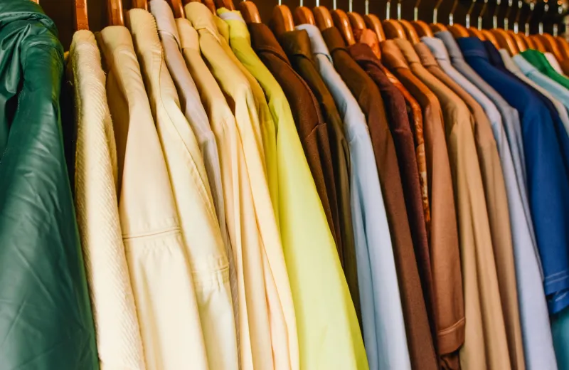
Analogous colors live next to each other on the wheel — like teal, blue, and violet. These combos feel harmonious and sophisticated without being safe or boring. They read as intentional, almost editorial. A teal satin blouse tucked into an indigo pleated skirt with violet accessories is the kind of tonal depth that stops people mid-scroll.
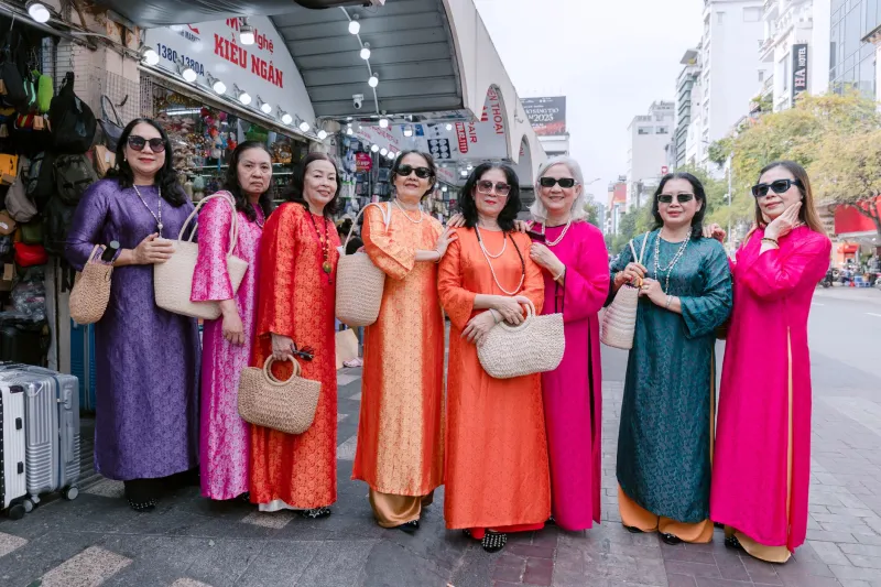
Triadic colors divide the wheel into thirds: red, yellow, and blue, for example. This is where things get genuinely bold. Triadic palettes feel playful, energetic, and maximalist — but they require balance. If you're going full triadic, let one color lead and use the other two as accents, or you'll cross from vibrant into visual chaos real fast.
Why Some Combos Feel Like Noise
Here's where the psychology gets interesting. According to color theorists, our brains are wired to seek resolution — we want visual information to make sense. When two colors compete at the same intensity, the same saturation, and the same value (that's lightness versus darkness), our eyes literally can't decide where to focus. That's what creates the dreaded "clash."
The most common offender? Pairing two neon or highly saturated colors of similar brightness without any contrast in tone or value. Hot pink and lime green at the same intensity level, for example, creates what designers call simultaneous contrast — the colors actually appear to vibrate against each other. It's not that the colors are wrong together; it's that they're fighting for dominance with no resolution in sight.
The fix is almost always about adjusting value. Pair that hot pink with a deeper, more muted olive green instead of neon lime, and suddenly the combination breathes. One color leads, the other supports. The eye relaxes. The outfit lands.
Real Outfit Breakdowns That Actually Work
The Unexpected Win: Red + Pink For years, red and pink were considered a fashion faux pas. Now? They're arguably the most chic pairing in the game. The reason it works is tonal relationship — both colors share a warm base, so they don't fight each other's undertones. A cherry red blazer over a dusty rose slip dress feels luxurious and intentional. Pro tip: make sure one shade is deeper or more saturated than the other to avoid that washed-out effect.
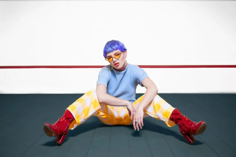
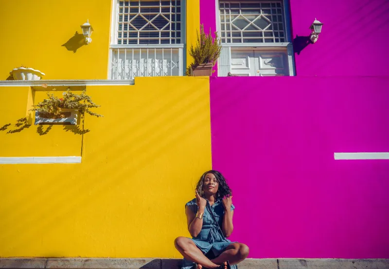
The Power Move: Purple + Yellow This is a complementary combo that hits differently when you adjust the shades. Deep plum paired with a warm mustard yellow? Sophisticated and rich. Bright violet with lemon yellow? Maximalist and joyful — but keep accessories neutral (think nude or white) so the look doesn't tip into overload.
The Surprising Harmony: Orange + Blue This one surprises people every time. Orange and blue are complementary colors, which means they were literally made to be together. A terracotta orange wrap dress with cobalt blue strappy heels and a matching bag? That's not a risk — that's a recipe. The key is keeping the silhouette clean so the color does the talking.
The Tricky One: Green + Red Yes, this is a complementary pairing — and yes, it works outside of December. The trick is steering away from the literal Christmas combination. Try sage green with burgundy, or forest green with coral red. Shifting the shades away from their most saturated versions immediately moves the look from holiday card to runway-ready.
What the Stylists Actually Say
Professional stylists will tell you that the number one mistake clients make with bold color isn't choosing the wrong colors — it's choosing the wrong proportions. The 60-30-10 rule is a classic interior design principle that translates beautifully to outfit building: let one color make up about 60% of your look (usually a base piece like pants or a dress), a second color cover about 30% (a top or jacket), and a third color appear in just 10% (accessories, shoes, or a bag).
This structure gives your eye a place to rest and a place to wander — which is exactly what makes an outfit feel intentional rather than overwhelming.
Stylists also emphasize the power of neutral anchors. You don't have to go full monochrome or play it safe — you just need one grounding element. White sneakers, a camel-toned bag, or even a nude sandal can bring the whole look into focus without dimming any of the color energy.
Your Permission Slip to Experiment
Here's the real talk: color rules are starting points, not finish lines. The most stylish people aren't following a formula — they're understanding why certain things work so they can break the rules with confidence. Once you know that value contrast is what separates a clash from a combo, you can start trusting your eye more and your anxiety less.
Start small if you need to. Swap out one neutral in your go-to outfit for a color that sits opposite your dominant hue on the wheel. See how it feels. Adjust. Repeat. Over time, your eye will start to calibrate naturally, and what once felt like a risk will start to feel like second nature.
Bold color isn't about being fearless — it's about being curious. And curiosity? That's always in style.
Ready to put this into practice? Pull out your boldest piece and start experimenting with the combos above. Tag us at @fuzifabulous — we want to see your color story.